

The latest League of Legends cinematic, titled Bite Marks, is absolutely breathtaking, showing us the brand new designs for many champions, including Darius, Katarina and Elise. But some changes are not good, now are they? Some champions might lose their aura, while others may gain some, through the changes in base character design. While I must say that Riot Games is often on point, not every visual update changes the character’s overall design for the better. In turn, I wonder, who got an upgrade and who got a downgrade? That’s where I come in! Here are the champions featured in Bite Marks, ranked by their new design.
6. Darius Looks Skinny, Unthreatening, With Stank Face and Ryu‘s Eyebrows. It Doesn’t Work.

Well, let’s talk about the elephant in the room, shall we? The majority of people scrunched their face when they first saw Darius, as he didn’t look like a macho man badass, with the most scary and intimidating aura in League of Legends. In other words, he didn’t look how fans thought he would look, which is a fair point considering that Darius has appeared in other cinematics, and in those, he’s looked FANTASTIC! So, why didn’t Bite Marks feature a buff, commanding, stellar Darius that all of us were expecting to see? Well, supposedly it’s a young Darius, who will grow into the badass we have learned to appreciate over the years.

What we got here is a lightweight Darius, who in all fairness, looks like Darius’s son, instead of the man he’s supposed to portray. It’s not just the lack in physical size, but the entire face looks different, and not for the better. In all honesty, the eyebrows throw me off the most, and he just has a stank face constantly, whether he’s fighting or not. I mean, it doesn’t make sense to me. In turn, I can’t wholeheartedly say that this design was good. If anything, it was decent. But time will tell whether or not we have reason to worry for the potential Noxus-Arcane spin-off.
5. Vladimir Looks Youthful and Fresh, Yet Tame and Simple In Comparison to Other Variations of the Champion.

We only get a quick glimpse of Vladimir at the end of Bite Marks, who’s still as timeless as ever before. With his white har, pale skin and red eyes, his features are what you’d expect, and that is a good thing. Isn’t it? While I would’ve loved to see a bigger overhaul, it’s a design that I can’t complain about either. You see, I’m somewhere in the middle with this new look. Why? It looks a bit too… “tame” and “simple”. Yes, that’s right. It comes across tame. It’s too soft for my liking. After all, we’re talking about a vampire. If I’m not scared or intimidated, I feel like it could be a bit better.
What really makes Vladimir come across a bit “tender” and “soft” is his behavior when talking to LeBlanc. It’s almost childish in a way, the way he shows fear and concern. It’s odd. Like, you are a vampire, my guy, get a hold of yourself! Nevertheless, it’s the design that could’ve been a bit edgier, you know? Like, with a vampire, it’s no holds barred. Just go crazy with creativity. I would’ve loved to see a more threatening behavior, but a threatening appearance would have done the trick. Sadly, neither the personality or the appearance are particularly good in my opinion. In turned, he’s ranked 5th on my list of the Bite Marks champions in the latest League of Legends cinematic.
4. Trundle Looks Buff, Fierce and Interesting. An Upgrade to Praise and Smash Your Keyboards Over!

Listen, whatever weight and aura Darius lost, Trundle gained, as the Troll King looks excellent! And I’m not surprised, considering that when Riot Games gave Trundle a makeover, many years ago, they made him look outstanding. In the same vein, Fortiche took what was already superb, adding their own twist, and elevating the champion design to a whole nother level. That’s what has happened with Trundle. It’s a masterclass in staying true to a concept, while still upgrading it with creative flair and new flavor.
3. LeBlanc Rocks an Elegant Robe, Loves to Fingerpaint, and Looks Done With Life – It’s GREAT!

What an elegant redesign, isn’t it? The color scheme is majestic, the facial structure is that of a goddess, and her demeanor is that for a queen – it’s wonderful. I really like it, and the way that they waited until the end to reveal her design just made it more impactful. She got an upgrade. No doubt about it.
While the current in-game LeBlanc design is great, what they changed made the champion far more interesting. Whether it’s the paint on the fingertips or the golden marks under her eyes, there are many things that my mind starts thinking, and questions I want to ask. While these things might not be that big in the grand scheme of things, every small bit of a design is vital for a succesful, and lovable, champions.
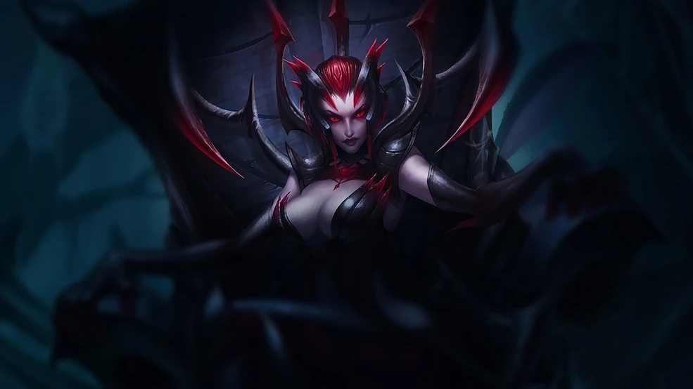
2. Elise Goes from Curvy to Petite, Looking More Alluring, Captivating and Intimidating Than Ever Before!

This might be a bit of a controversial take, ranking Elise’s new design as an upgrade, but I will do it anyway. It just feels right. But why would it be controversial? Well, many have noted that Elise is less… “busty“, if you know what I mean? Therefore, she’s far less sexy, and some people seem to have a bit of a problem with it. I, however, find her new look to be PERFECT. Just you wait. Come the new Fortiche TV series, people are gonna fall in love with Elise, as the current reaction and opinion will change over time. I’m sure of it. As for now, the people that love this design can rejoice as one, while the people questoning it will have to let it settle a bit.

Now to the design itself – it’s eyecatching. It’s one of those designs where certain things stick out, making it good overall. So, let me explain. Firstly, you instantly gravitate towards the red mask, which looks hand-made, with a very beautiful and elegant facial structure. While it’s a source of intimidation, it’s alluring. Secondly, the outfit is a sparkly leotard covered with some sort of vampiric armor – or so it looks to me. The golden accents and the wine red color on the hands is the key in pushing this design to another level. Last but not least, the way her spider legs and spiders look add another lever of depth to a character, which makes her interesting.
All in all, Elise looks like a badass villain, with an alluring appearance, a royal armor, and an undeniably horrifying spider form. It’s a redesign done well. Really well.
1. Katarina Is the Talk of the Town, Looking Like a Freshly Picked Rose, Dipped In Red Paint and Covered In the Hurt of Past Pain – She’s Gorgeous!

First and foremost, let’s get one thing straight, shall we? Katarina has always been a looker. She is considered to be one of the hottest female characters in League of Legends. Even back in the day when she was all types of pixels and polygons, and that’s saying something, isn’t it? So, it’s impressive that Fortiche was able to take that design and run with it, improving it slightly, but also making Katarina feel more “human”. She’s more grounded, in a way, where sho looks really like a person, while in League of Legends she looks like a superhero. In other words, a job well done!
Katarina’s look in the Bite Marks cinematic has caught the attention of many, with fans saying that she’s the “new Vi”. The girl character that is gonna be badass, be beloved by girls and boys, while also having some type of a romantic thing going on with another hot character. It’s really not surprising. I mean, Katarina’s look is great, and if people love it, give ’em more of it. So, I’m happy to speak for all Arcane fans when I wish Fortiche good luck on their future projects!
Last but not least, a good design is usually pretty universal. It’s the reason Katarina has gotten so much traction. Like, people are dropping their jaws seeing her in this cinematic. I guess it goes to show that well-designed characters can do a lot, and this is a case where one character stole the show – that’s Katarina! Now, go ahead and rewatch the League of Legends’ “Bite Marks” cinematic 20 more times, just like I will!


